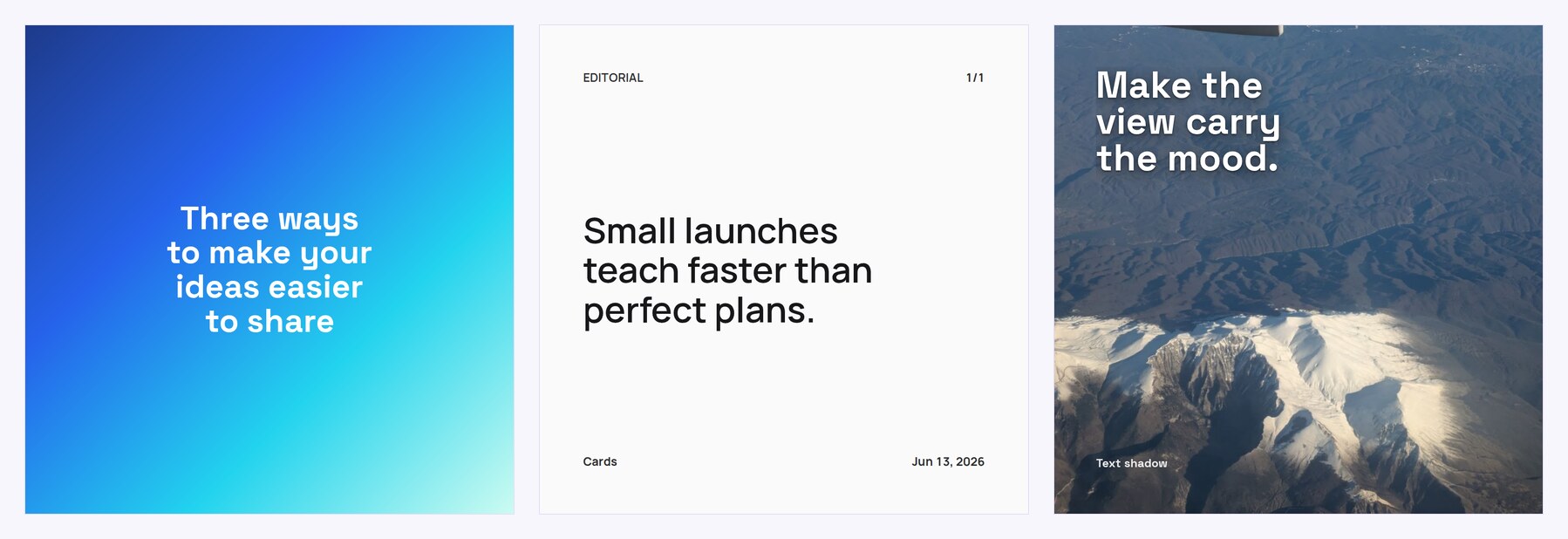
The words are usually finished long before the images are. Then comes the part that has nothing to do with writing: split the paragraphs across slides, match the type, align the padding, check that the byline on slide seven sits where it sat on slide one, export everything at a size the platform accepts. That is half an hour per post, and most of it repeats what you already did last time.
Cards covers that part. You paste finished text, the app splits it into cards, keeps one layout across the set, and hands back images ready to publish. The wording stays yours: nothing is rewritten, shortened, or generated. The app lays out the exact text you gave it.
How it works
Your text sits on the left of the editor, the deck builds itself on the right. Splitting can stay automatic, or you can place a break by hand with a separator line, which matters when a thought should end on a particular phrase rather than where the card ran out of room. Splitting by Markdown structure works separately: headings, quotes, lists, and code blocks each get their own slide and the styling that fits them. That part is free, and it suits technical writing where the structure is already marked up.
Styling is set once for the whole deck: platform preset, typeface, size, colors, background. Header, footer, author line, date, and slide numbers are optional, and they repeat on every card in the same place. That is what makes a feed look deliberate even when the posts were written weeks and moods apart.
The opening slide of a carousel. The cards that follow keep the same type, spacing, and byline.
The export repeats the preview. That sounds like a small thing right up to the moment an export shifts the text a couple of pixels and the byline runs into the edge. Here the images are built from the same layout the editor showed: same spacing, same typography, same colors.
What you can take out of the editor
PNG or JPEG at 1x and 2x, a ZIP with every slide, an HTML bundle for offline viewing. A subscription adds MP4: the same deck rendered as video up to thirty seconds, with one of twelve motion presets. The render runs on our servers, so no video editor is involved, and the motion preview plays in the editor for free, which means you can judge whether you need the format before paying for it.
Presets cover Instagram square (1080 × 1080), portrait (1080 × 1350), Stories (1080 × 1920), LinkedIn (1200 × 627), and X (1600 × 900). Instagram and LinkedIn accept up to twenty slides per post, and the app stays well inside that.

Text over a photo: a shadow and a translucent panel keep the copy readable on any image.
What is free
The editor, the preview, image export, Markdown structure splitting, six grid collage layouts, and the motion preview cost nothing and need no account. There is no watermark and no sign-in wall before the download. A free carousel stops at eight slides, signing in raises that to eighteen and adds saved projects, so a draft is still there a week later.
The subscription covers three things: the video render, building a carousel from a published article URL, and shaped collages (diagonal, diamond, chevron, wave, arch) together with carousels up to two hundred slides. URL import reads the page and pulls the article text out, keeping the author’s wording intact.
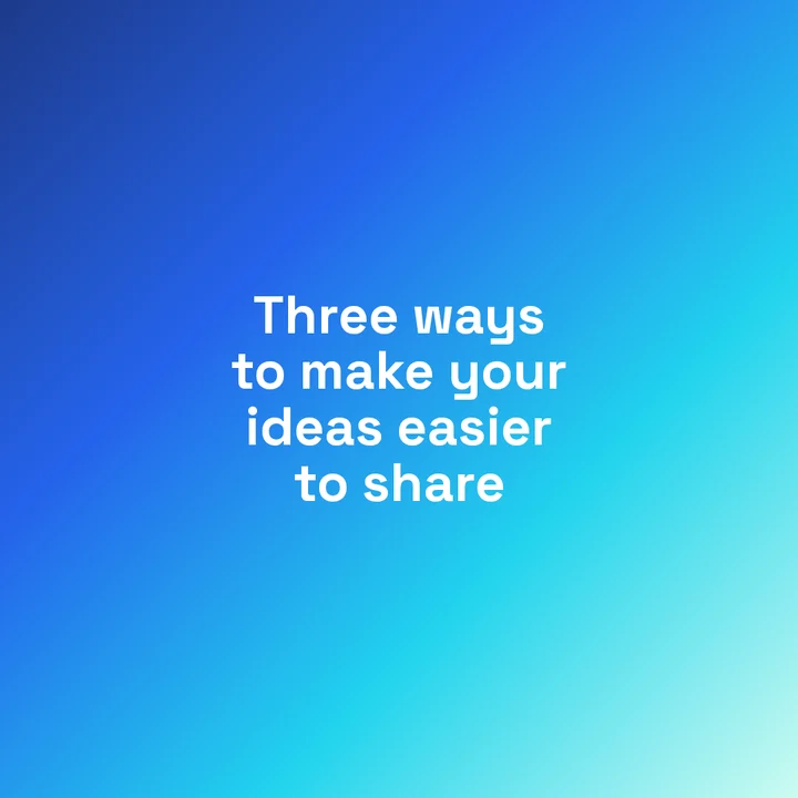
Monospaced type for short lists: weekly metrics, product changes, build notes.
Who it suits
People who publish regularly and handle their own visuals. A newsletter writer pulling a passage from an issue into the feed. A small team showing once a week what changed in the product. Someone running a blog who would rather not open a design tool for a single quote. Working with text stays textual here: you edit words instead of nudging rectangles.
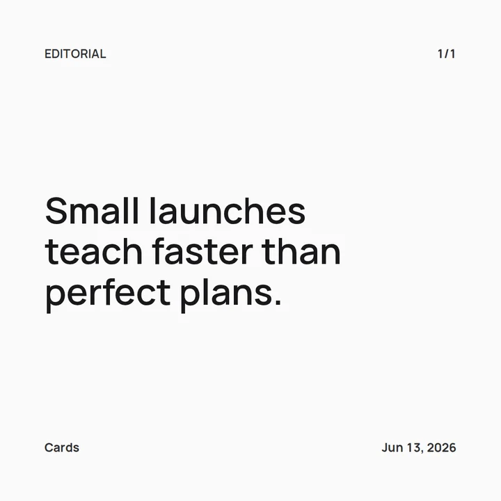
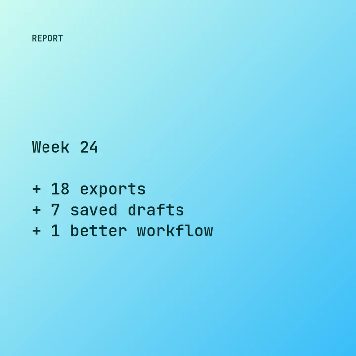
A single quote card: header, byline, and date sit where they sit on every other slide in the deck.
The app does not try to be a design tool. If you need an illustration with a complex composition, freely placed elements, and hand-shaped forms, that is a job for Figma or Canva. Cards handles the case where the text exists and has to look the same, several times in a row, quickly.
Where it came from
It started in 2025, out of a personal need. Dani writes fantasy and wanted to post micro-stories on Instagram as cards. The drafts live in Obsidian, so the text was ready in advance; the slow part was the layout. Even a short story runs across several slides, and in a visual editor one changed phrase near the beginning means redrawing by hand everything that follows it.
The first version was a Go script: text in, images out, with the splitting handled by the script. Dani posted about it on Twitter and a few people asked for the same thing. Talking writers through a command line did not work, so a visual version followed, the kind you can open in a browser. The full account is on the About page.
The character of the tool grows out of that story. A first pass at the styling is quick, and the result is won on small corrections, which is exactly what Cards tries not to turn into a redraw of the whole deck. How the text gets split into evenly filled slides is covered in a separate note on splitting, and how text is measured before it is drawn is in the note on measurement.
More from the app
The gallery holds ready-made card styles: each one opens in the editor as a starting point, with your own words swapped in. The guide on turning an article into a carousel walks through the path from a published text to a deck. The comparison of carousels and video explains how a carousel differs from a vertical clip and which one fits a given task. What the subscription covers is listed on the Pro page.